Illustration system
Challenge
TurboTax completed a full brand refresh with a new voice, new visual direction, and new ambition. But a ten-year-old illustration and icon system that was charming in its time was no longer credible at the scale TurboTax operates today. The visual language that showed up on every surface contradicted the brand's new positioning.
Solution
Tax is complex and high-stakes. Illustration's job is to simplify, guide, and make a difficult process feel intuitive. The old system had done that well for a decade but was too casual, too soft, and too sprawling to carry the brand forward. Spring defined the balance precisely: 70% tech-forward, 30% humanity. Calibrated to modernize the brand with an intentional vision for what taxes should feel like.
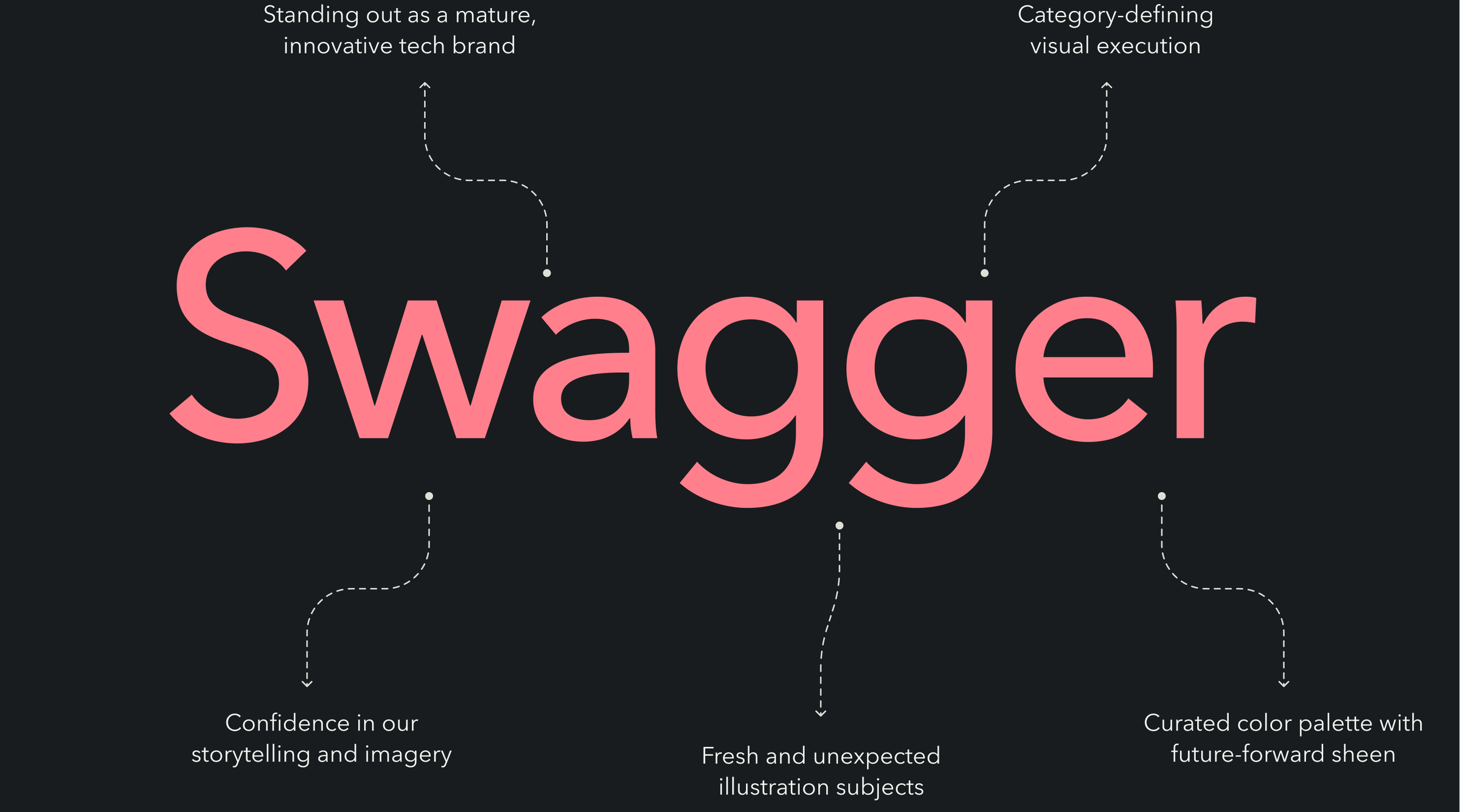

The governing principle was swagger
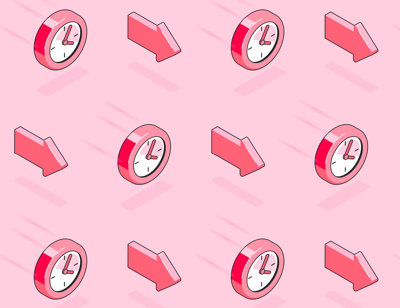
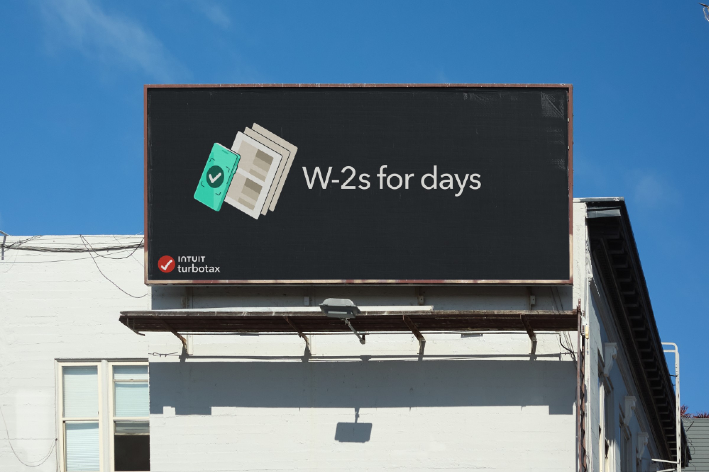
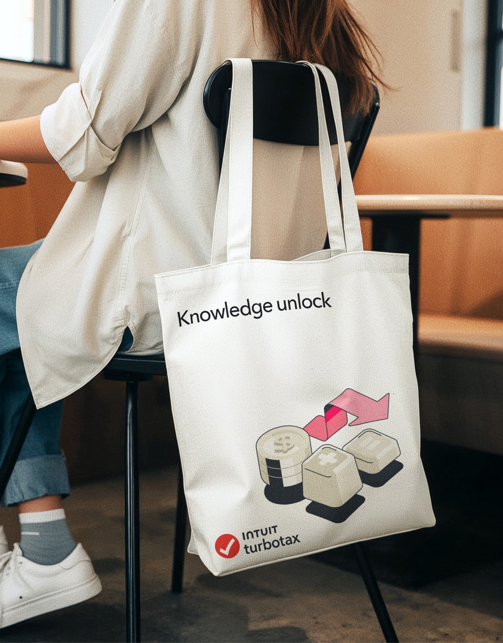
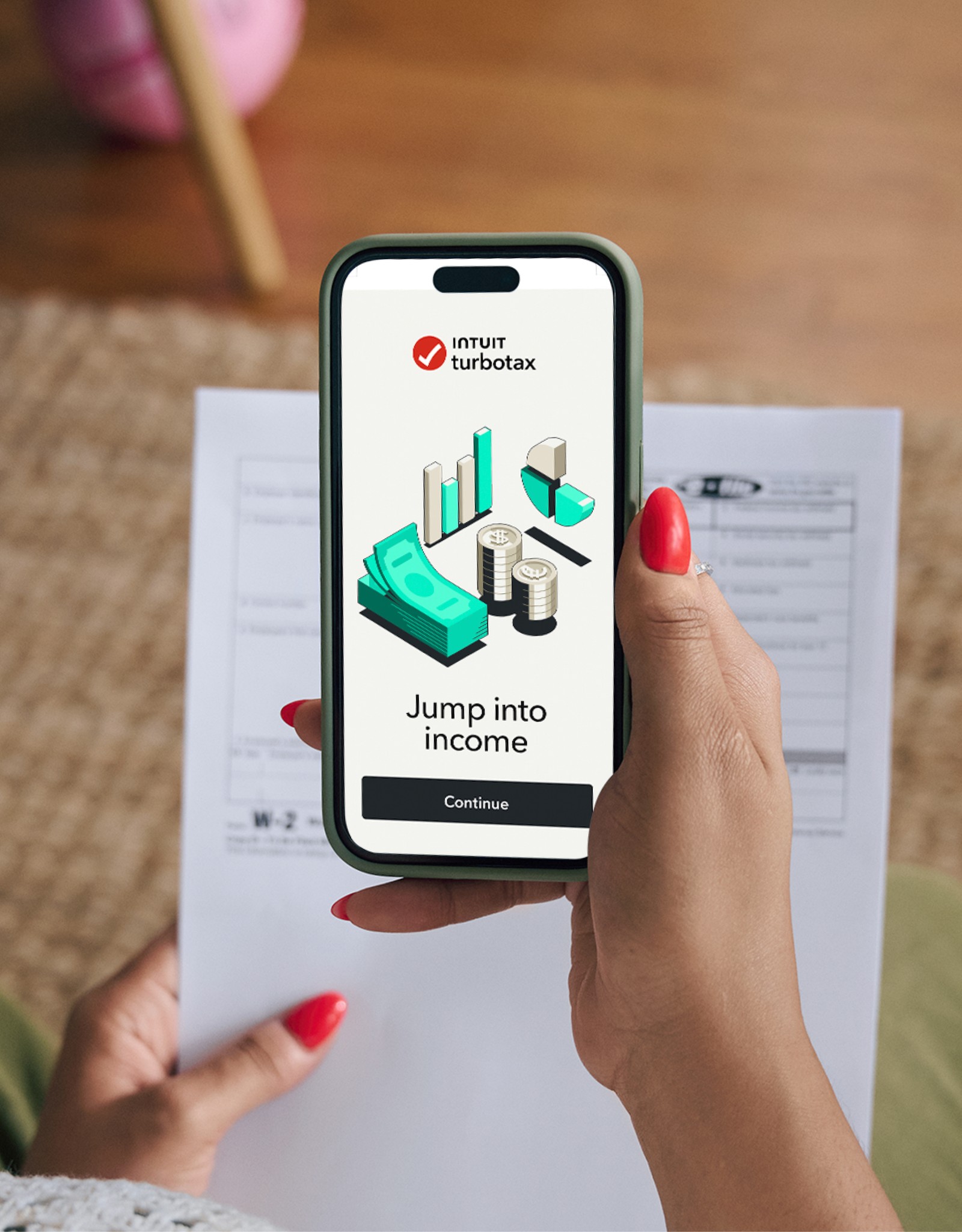
Spring defined the visual balance at 70% tech-forward, 30% humanity, then built a full isometric system around it. Clean visual metaphors simplify complexity. A bold shadow treatment gives every asset its signature confidence.


Illustration’s job is emotional
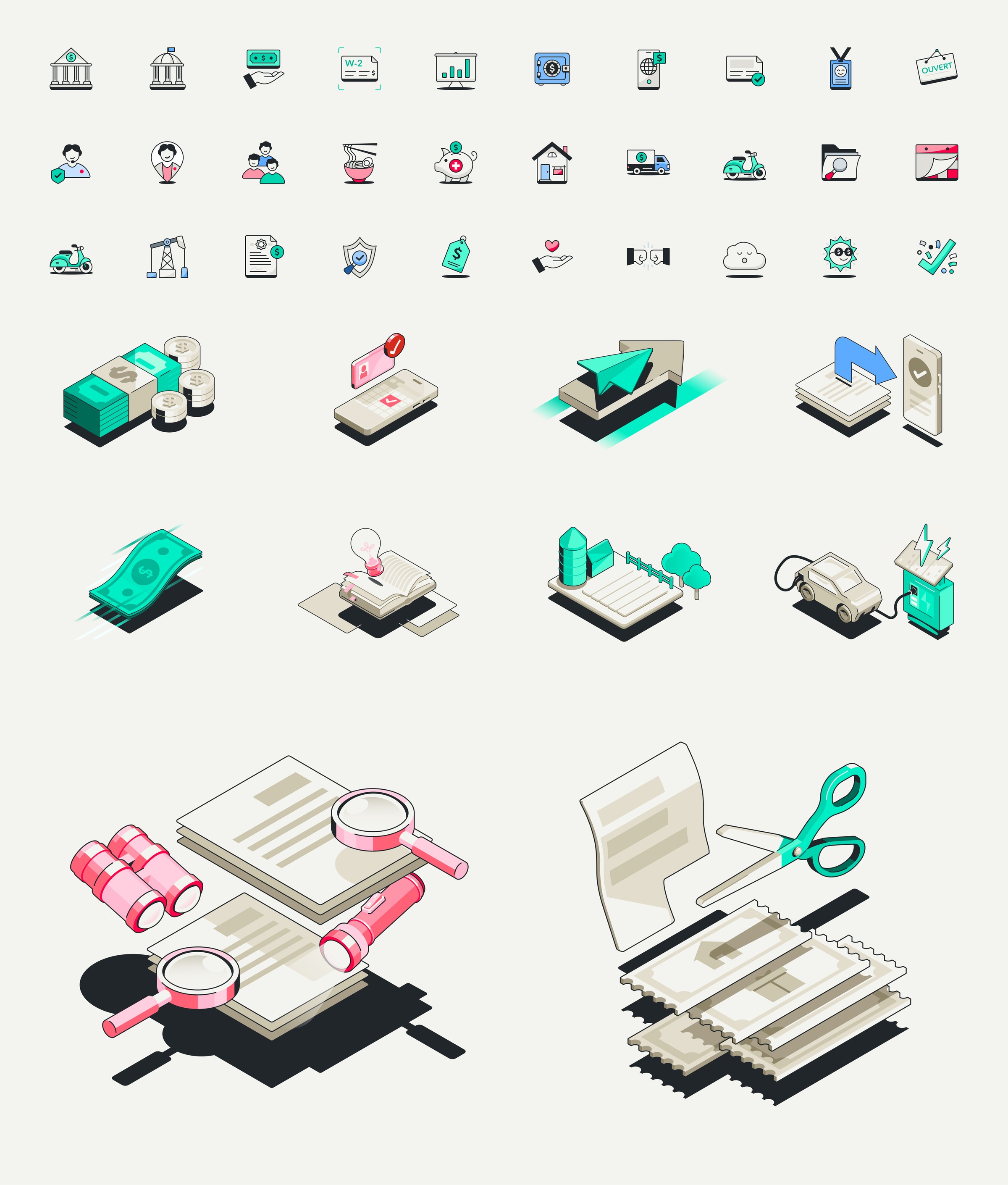
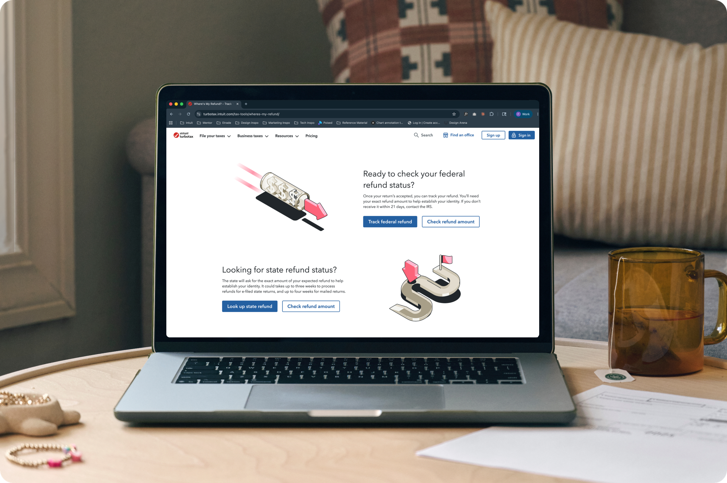
The system is built to make taxes feel more human and customers feel more confident navigating them. Spot and scene illustrations turn complex topics into moments of delight through isometric visual metaphors. Animations bring the full story to life in motion. All-new patterns extend the system across surfaces. And every asset is calibrated to work across both marketing and product environments without losing coherence.
Impact
Full overview
TurboTax had just completed a full brand refresh with a new voice, new visual direction, and a defined brand persona that positioned TurboTax as a mature, tech-forward category leader. But the illustration and icon system was a decade old, built for a friendlier, softer chapter of the brand, and showing its age across every customer touchpoint. Leaving it as is meant every surface carried a visual signal that contradicted the brand's new ambition.
Spring was positioned to see this clearly and act on it. No external partner carried the same context about the brand had been and what the system needed to do across a product as complex as TurboTax.
How do you make a tax brand feel human without feeling soft? TurboTax's new direction was tech-forward, confident, modern, category-defining. But illustration's job has always been to bring warmth to a brand that deals in one of the most stressful annual experiences most people face. Push too far toward tech and the system feels cold. Stay too human and it undercuts the new positioning. Spring resolved this with a precise creative brief: 70% tech-forward, 30% humanity. That balance became the foundation for every decision that followed.
The guiding principle was Swagger. An isometric style with clean visual metaphors, a bold shadow treatment that grounds every asset, and a curated palette with a future-forward sheen. The isometric approach translates complex tax topics into clear, intuitive moments. The shadow treatment creates a bold presence. Every decision had a rationale.’
Spring led creative direction across the full illustration and icon hierarchy, working in close partnership with Instrument, who executed illustration and motion. Then, we made reshaped our library to ensure we were telling visual stories with intention. Primary icons reduced from 406 to 243, spot illustrations grown from 69 to 94, scene illustrations consolidated from 22 to 10, and four large production animations fully rebuilt. In parallel, Spring developed a bespoke Canada market variant with 17 spot illustrations, 2 scenes, and 8 primary icons, maintaining full visual consistency with the US system while addressing Canadian market needs.
The system launched in phases across the 2024–2025 tax season. For the first time in a decade, TurboTax's visual language is cohesive across every customer touchpoint with a system built to stay that way.
Spring role
- Creative direction
- Illustration system strategy
- Product integration
Collaborators
- Instrument - Production
- Vucko - Motion

Next Project
NYC out of home